
Empowering Your
Financial Journey.
UI/UX CASE STUDY
RESPONSIVE WEB DESIGN


Saving doesn’t have to be hard
Product Objective
Introducing Thrifti, the ultimate finance app designed for those new to managing money. With its user-friendly interface, Thrifti simplifies tracking and managing your finances, making it easy to stay on top of your budget. The app focuses on helping you save for specific goals, allowing you to set timelines and monitor your progress effortlessly.


Design Process
Leveraging the insights from my course, I connected with user stories and identified the tasks to be accomplished. I proceeded to the ideation phase by creating low-fidelity wireframe sketches, which I later digitized in Figma. To ensure the user remained the focal point rather than my own preferences, I conducted user tests before finalizing the designs.


User Stories
As a user, I want to see a dashboard of my finances clearly and visually, so that I can see how much I am spending on what at a glance.
As a user, I want to see an overview of how much my finances have changed and how much I am saving throughout the saving period, so that I can stay on track.

As a user, I need to be able to tell the tool what my savings goal is and how long I have to reach it, so that I can save accordingly.
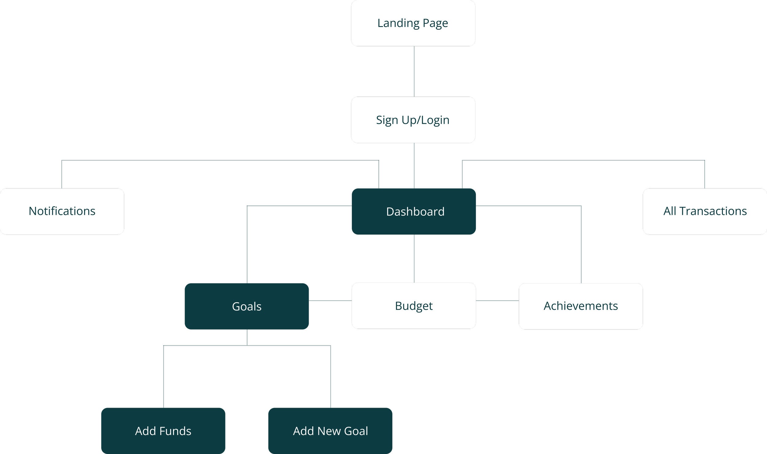
User Flow Diagram
I chose to focus primarily on the steps a user would need to take in order to input financial goals, add money, and see an overview of their financial activity.
Success Criteria:
User can access a dashboard
to see their overall financial
activity.
User can input financial goals
and create a savings budget
and timeline.
User can see what they are
spending money on by
viewing transactions.
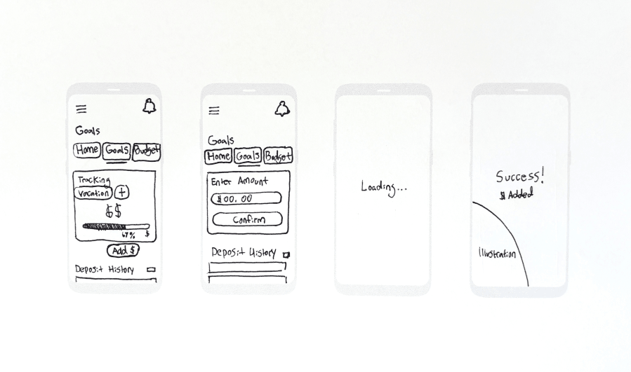
Low-Fidelity Wireframes


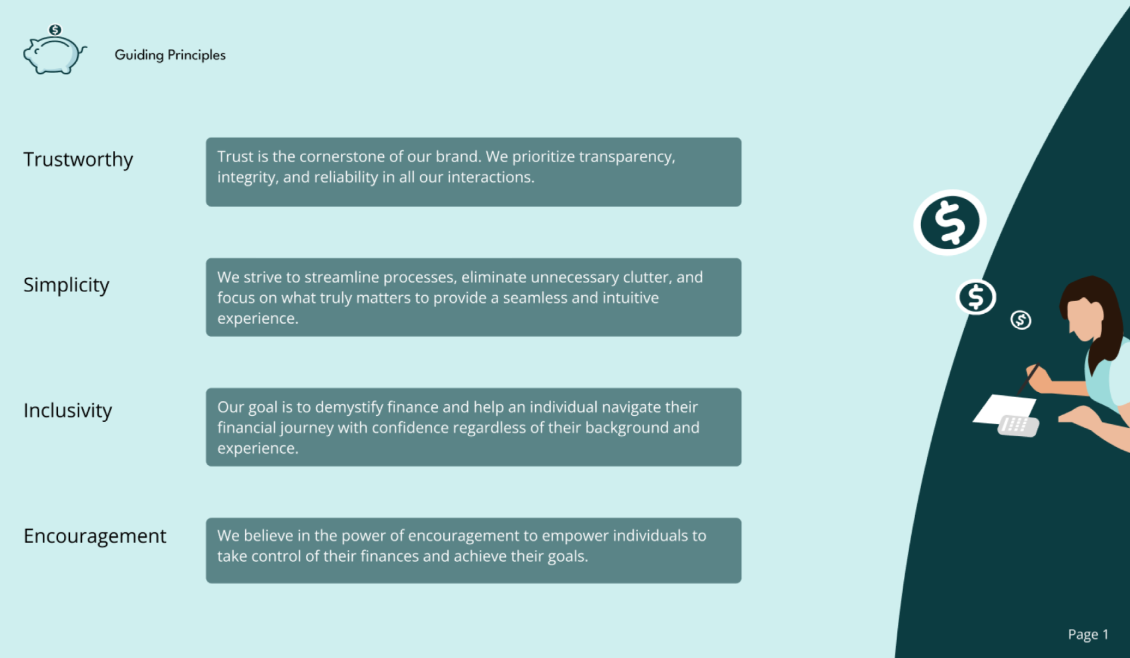
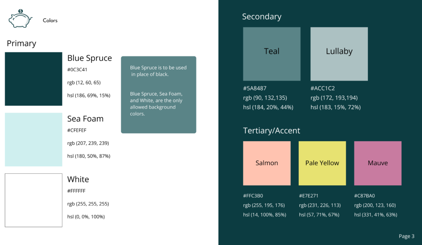
The Brand
I created a brand guidelines document for Thrifti, emphasizing its core principles which are: trustworthy, simple, inclusive, and encouraging. These guidelines ensure Thrifti remains reliable, easy to use, accessible to all, and supportive in helping users achieve their goals.


Mid-Fidelity Wireframes


Illustrations
I crafted illustrative figures from simple shapes to embody the guiding principles of the brand: Trust, Simplicity, Clarity, Inclusivity, and Encouragement.


User Feedback
Before I proceeded to creating my high-fidelity wireframes, I decided to test an early prototype of my design to identify pain points.
You are a returning user to the app. After logging in, you remember that it’s time to add funds towards your current goal.
The Scenario:
Success Criteria:
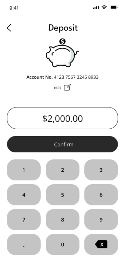
Add money to savings goal.
Participant One

Pros:
They thought that the navigation was intuitive and easy to use.
Cons:
They were confused by “tracking” terminology and a lack of being able to see a timeline with the analytics display.
Participant Two
Pros:
Really likes the minimalistic design.
Cons:
They thought the design may be too squished. The text “Target $8000” may be overlapped at some point by the percentage display on the
meter.
Pain Point
User one was confused by the word: “tracking” on the goals page where the user expected to see a display of the timeline relative to their goal.
Priority
Critical
Solution
Add a timeline progression display that reflects the timeline the user input for reaching their goal.
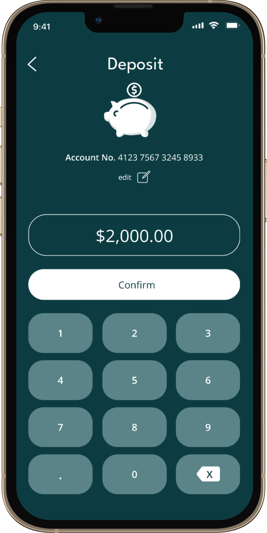
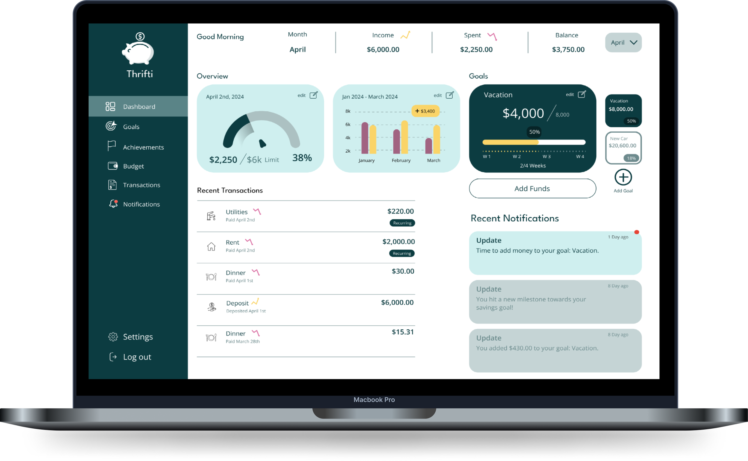
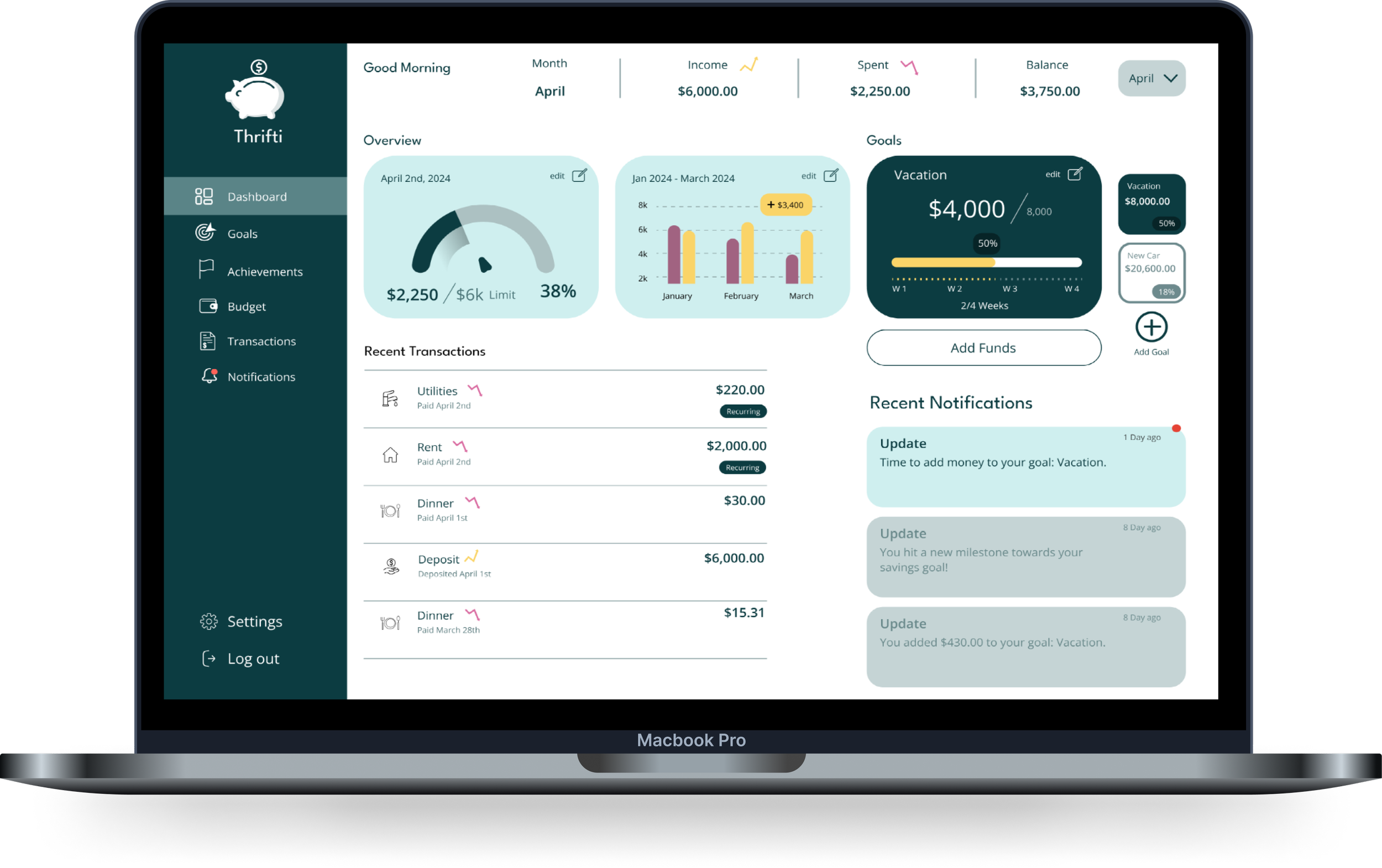
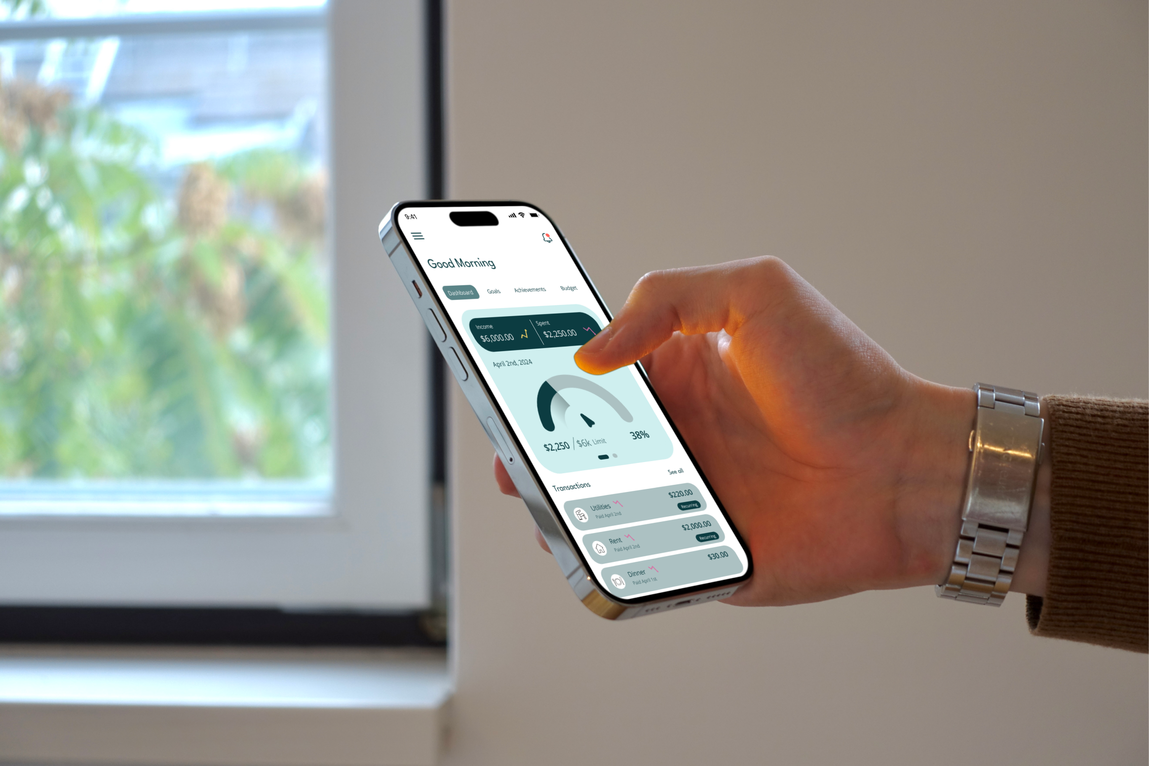
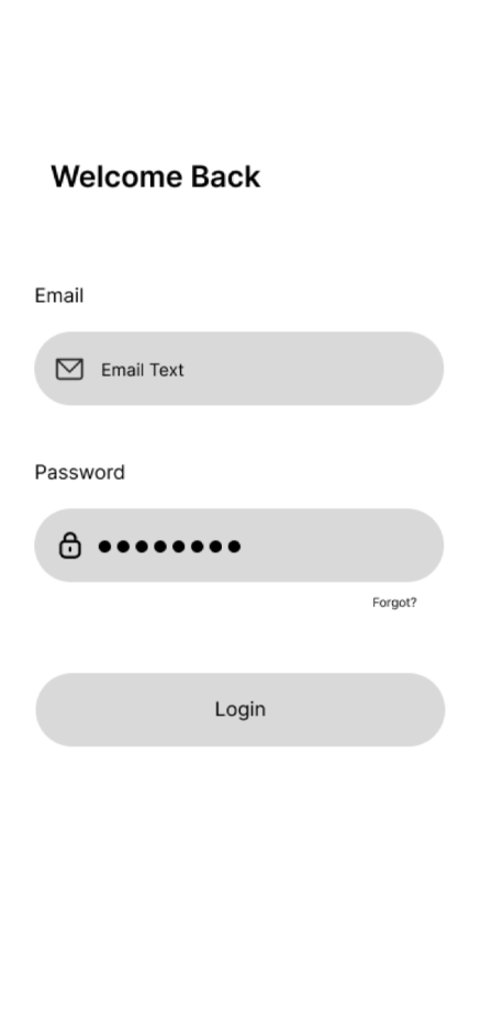
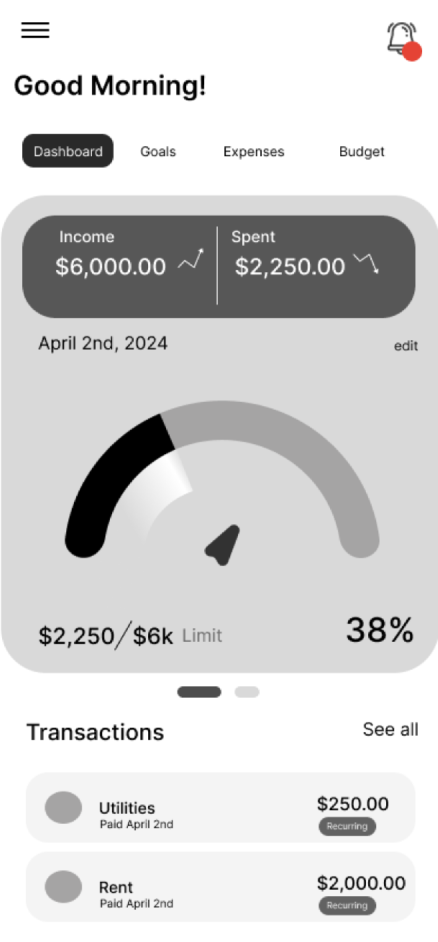
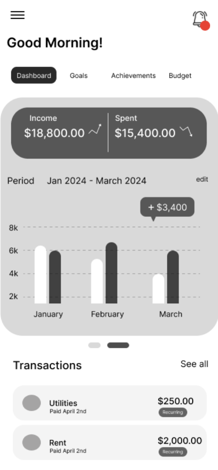
High-Fidelity Wireframes


Analytics
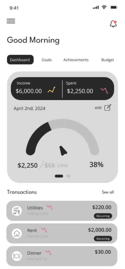
Dashboard

Top Navigation
Users can cycle through four different finance categories.
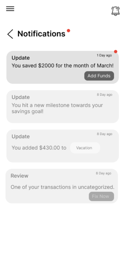
Users will be notified about various
financial activity including alerts.
Notification Icon
Users have a visual display of their monthly limit, which shows how much they’ve spent during a given time period.
Finance Overview
Users can see how much they’ve spent overall vs how much money they’ve made.
Transactions
User can check all recent transactions and can see even more details if they click on “See All”.
Goals
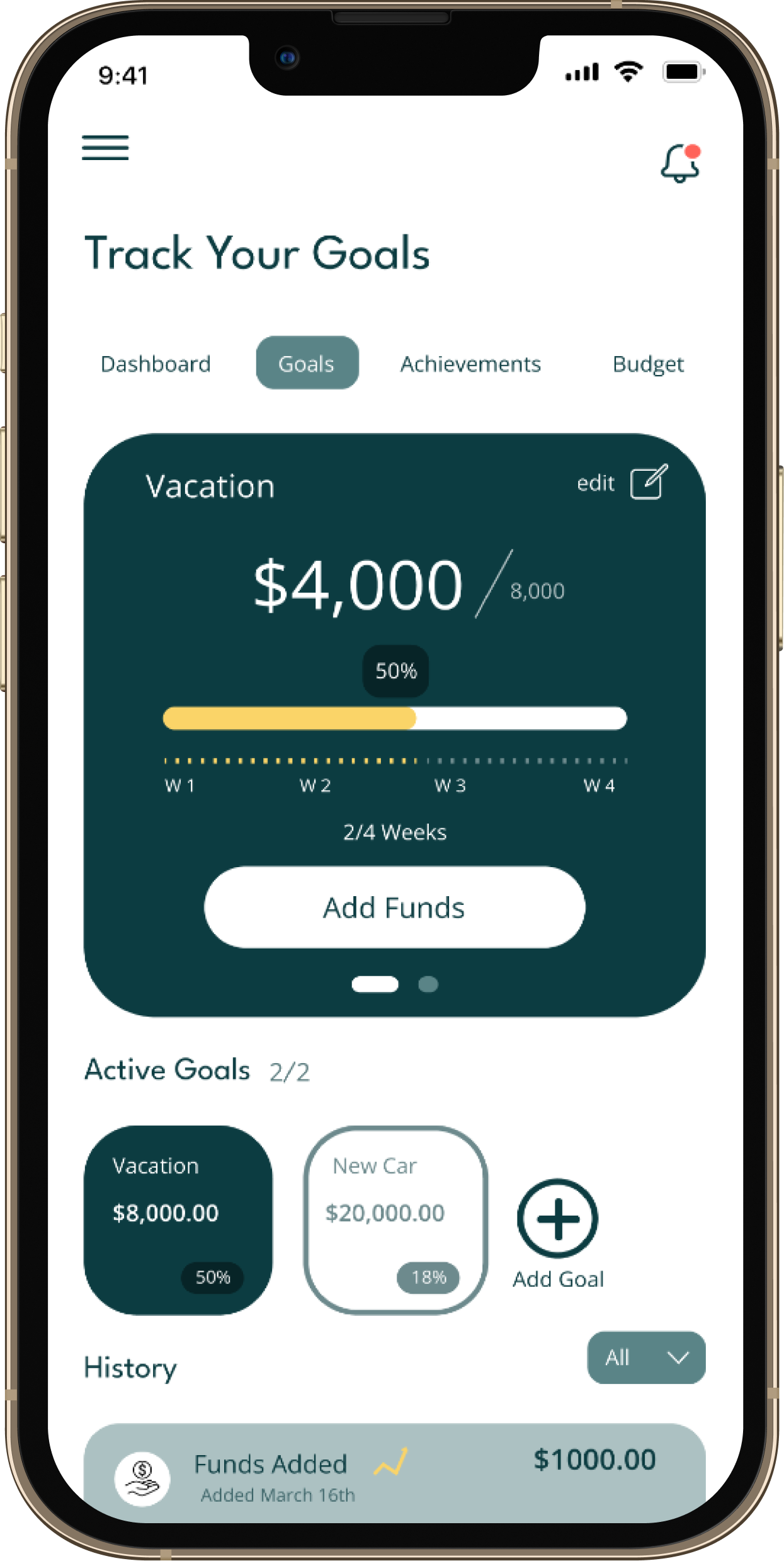
Goals Display
Users can a see a visual analytics display of various goals they are saving towards.
Timeline
Users can see how far along they are in the shown timeline to make sure they are on track.
Active Goals/New
Users can cycle through active goals and add new ones.

Monthly Limit